
Reports
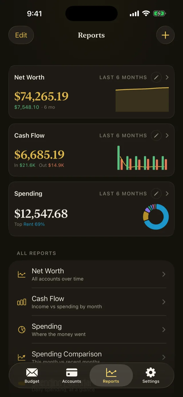
Five reports and a dashboard you arrange yourself, for seeing where the money actually went.
The Budget tab answers what you can spend. Reports answer what you did spend, and what that adds up to over time.
Reports only read your data. Nothing in this section changes a balance, an assignment, or a transaction.
The dashboard
The Reports tab opens on a dashboard you build yourself from cards. A card is a saved report with its own period, filters, and grouping, so the questions you ask every month are one tap away.
Refer to Build your dashboard.
The five reports
| Report | Answers |
|---|---|
| Net Worth | What everything adds up to, over time. Can be stacked by account. |
| Cash Flow | Income against spending, by month |
| Spending | Where the money went, broken down by category or another grouping |
| Spending Comparison | This month against recent months |
| Spending Calendar | Daily spending as a heat map across the month |
Tap All Reports to open any of them full screen.
Periods, filters, and grouping
Every report takes the same three controls.
Period sets the range, from the presets or a custom span.
Filters narrow which transactions count, by account, category, payee, tag, or amount. They are the same filters as the register’s.
Group by changes what the breakdown is cut by, so a Spending report can be read by category, by payee, or by account without changing anything else.
Together they turn five reports into as many questions as you have.
Reading the charts
Scrub along a chart and the value at that point is shown. In the Spending report, tapping a category opens its detail: the transactions behind the number.
That path from a chart to the actual rows is the one worth knowing. A number that looks wrong is usually one uncategorised transaction, and this is how you find it.
Chart colours
Chart colours are assigned by rank and never cycle, so the largest slice is always the same colour. That is deliberate: the fixed order is what makes the charts readable for colour-blind viewers.
Hide Amounts
Settings carries a Hide Amounts switch that renders every amount as dots until you turn it off. It applies to reports too, which is what makes it useful on a train.
Something wrong or missing on this page? Write to supportpentosbudget.com.